Identity overview
Brand & visual craft / HP
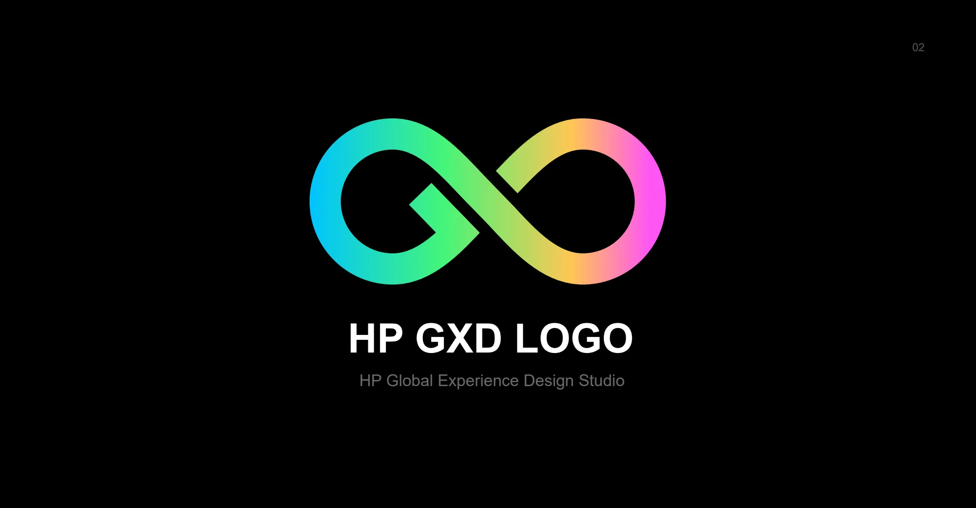
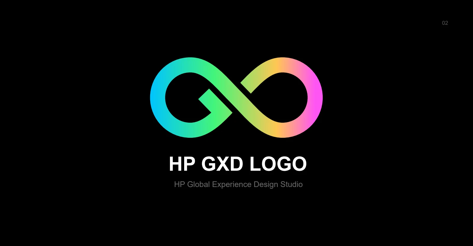
A connected mark for HP’s Global Experience Design studio in Singapore, designed to feel modern, adaptable, and full of character.
01 / The challenge
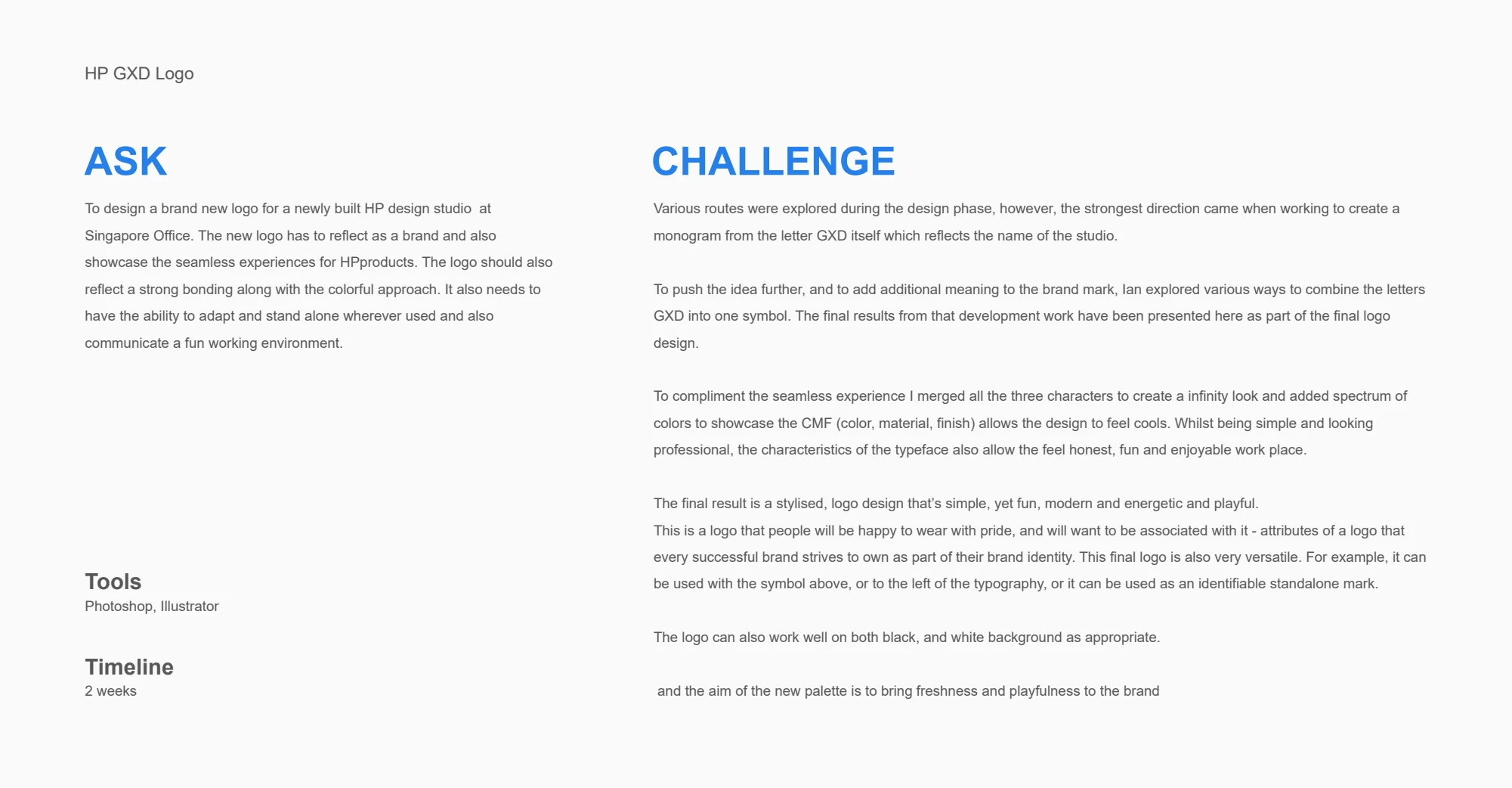
The new studio needed an identity that expressed seamless experiences, strong connections, and a lively working environment. The mark also needed to stand alone and adapt to different applications.
02 / My contribution
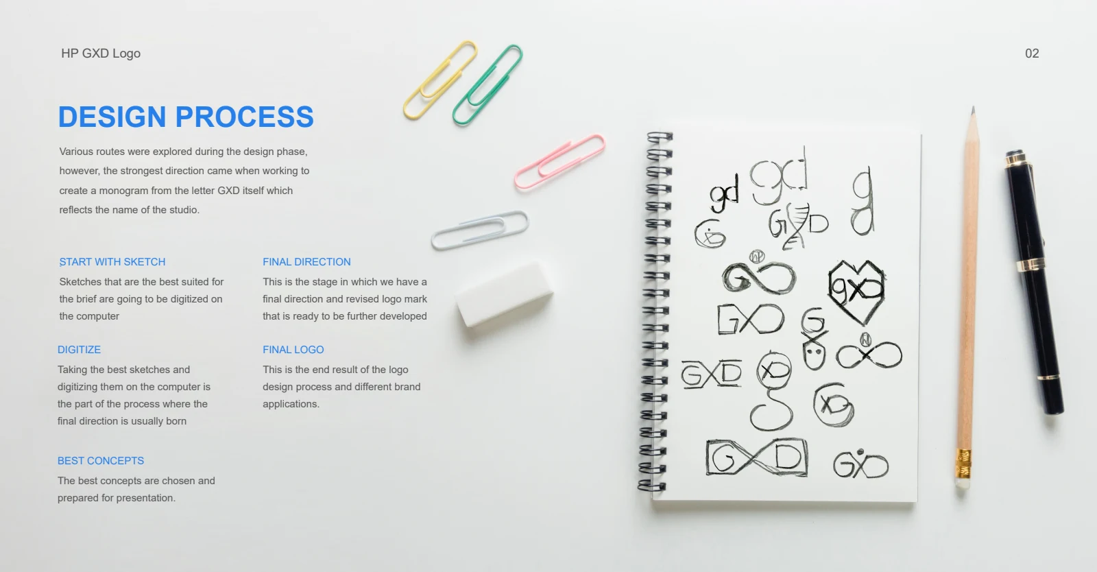
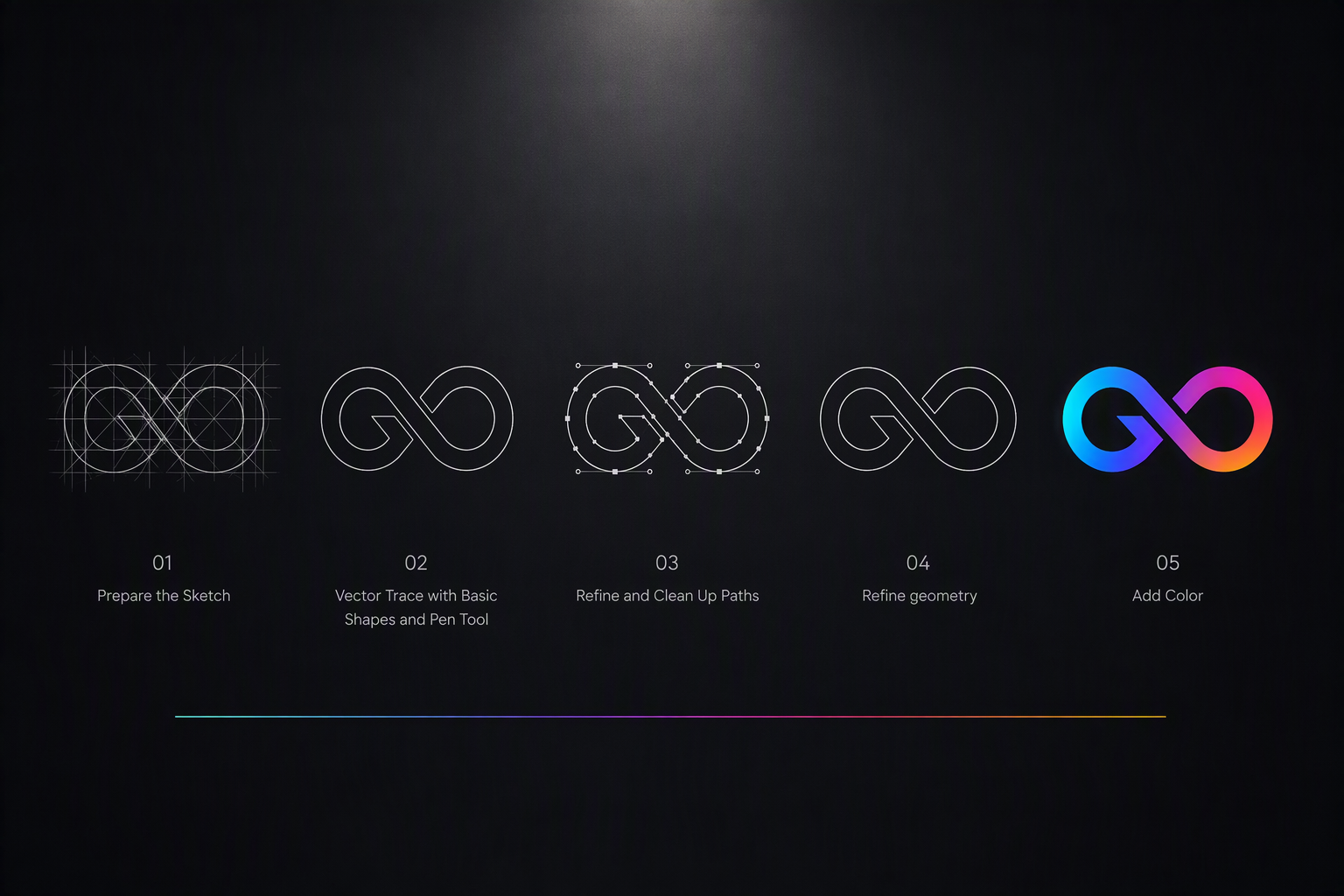
The portfolio describes an exploration of GXD monograms, developing the three letters into a connected, infinity-like mark. A spectrum of color added energy while allowing the identity to work against both light and dark backgrounds.
03 / Design decisions
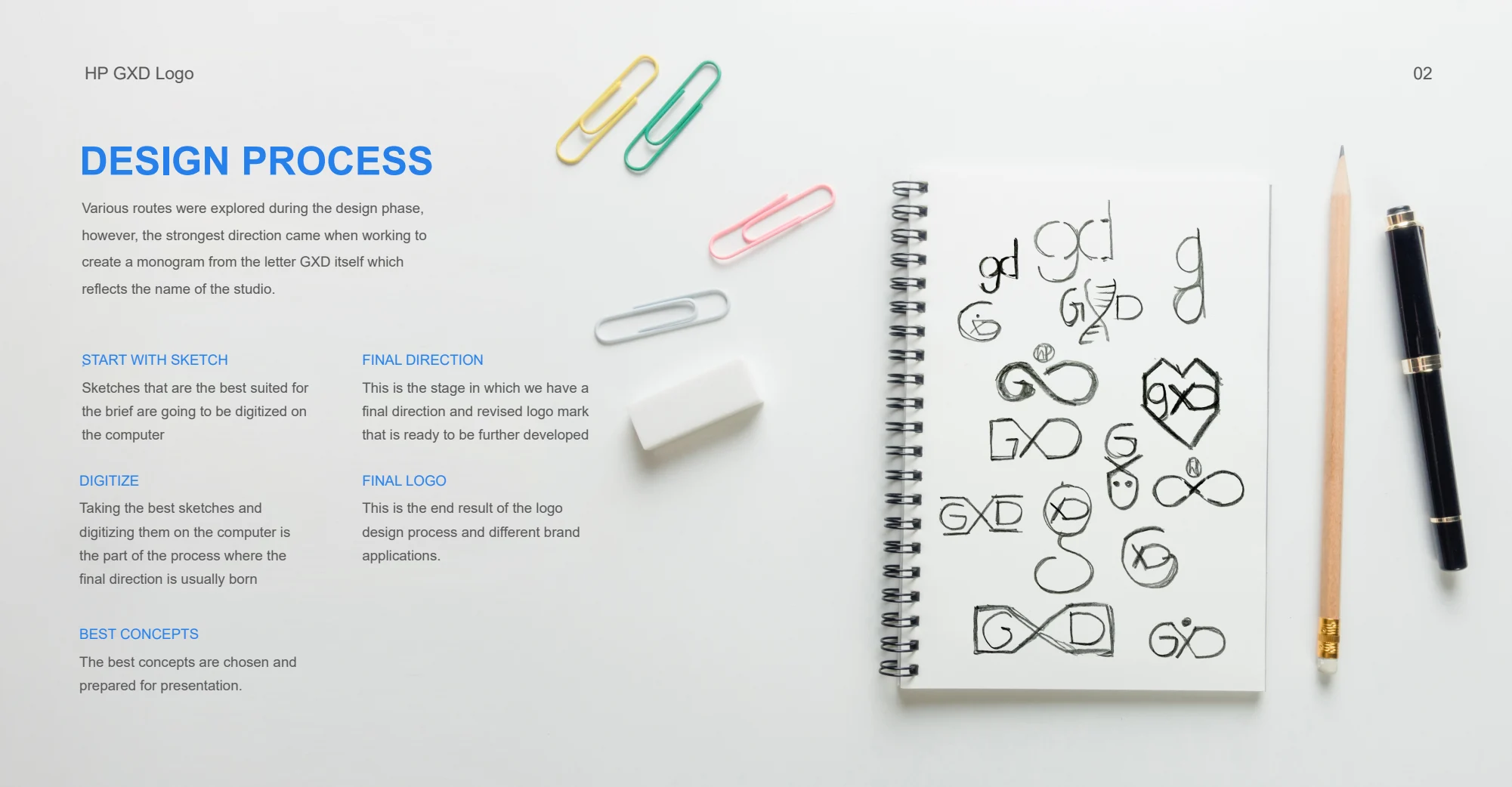
Move from varied directions to a focused group of monogram concepts before developing the strongest mark.
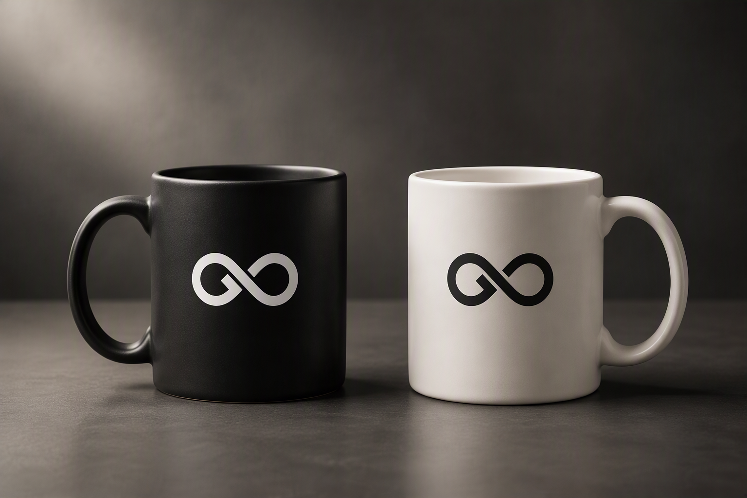
Consider the symbol on its own, alongside typography, and across contrasting backgrounds.
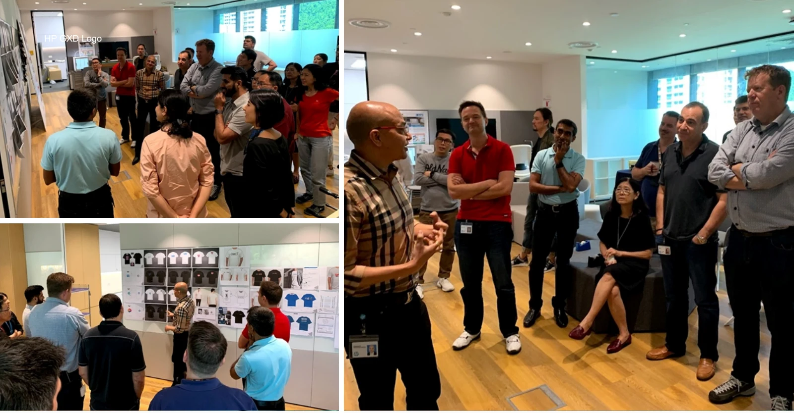
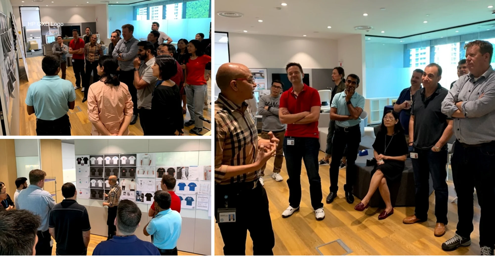
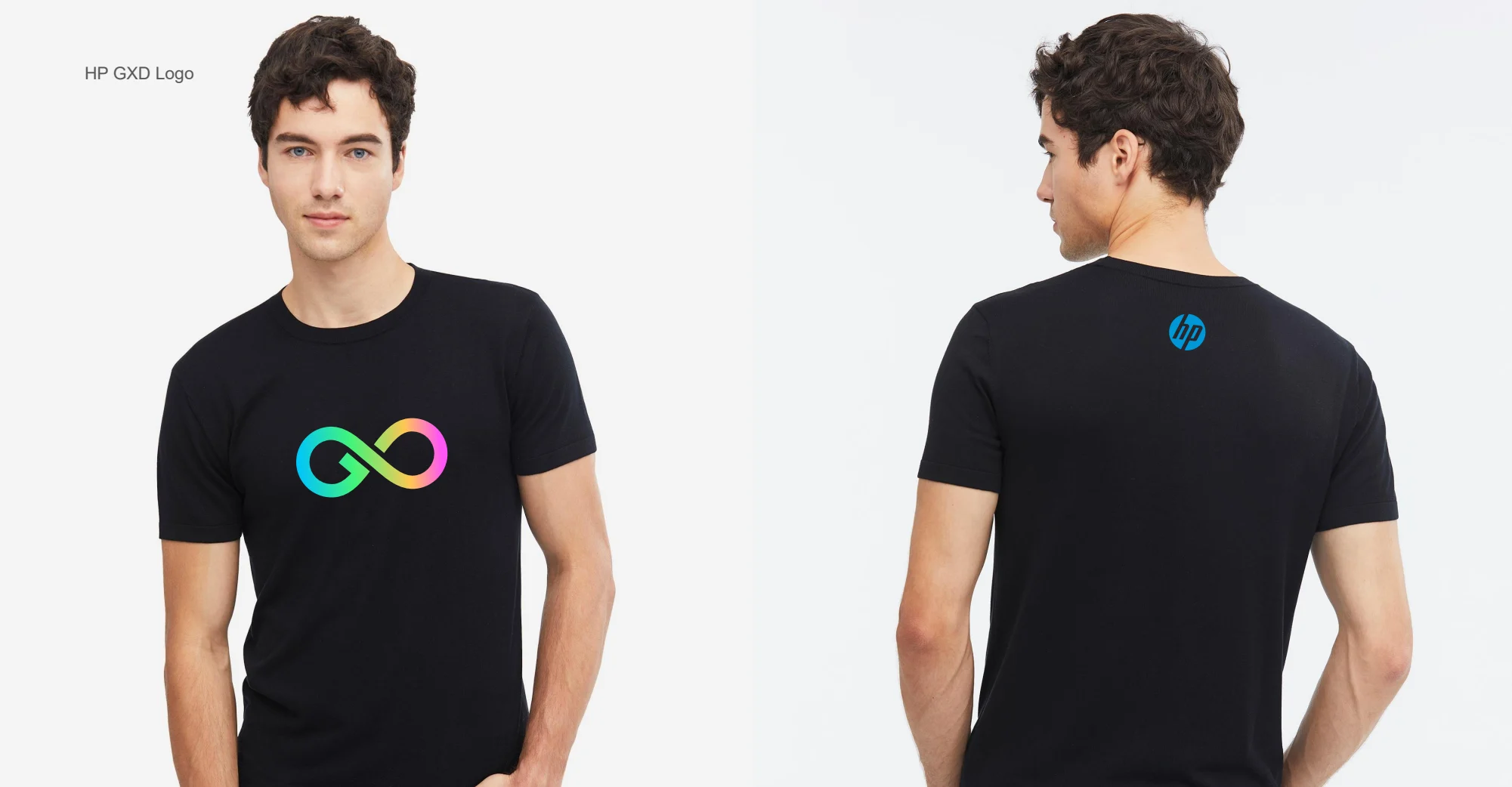
Bring the mark into physical and team contexts so it becomes part of the place and its people.
04 / Outcome & perspective
The final identity combines the studio’s initials in a connected symbol, with flexible arrangements and a colorful visual character. The portfolio shows it in the studio and team environment.
Visual identity can give a team a shared point of connection. This project also reflects the applied-arts foundation that continues to inform my product and design leadership work.
From the first question to the final detail
Explore the research, decisions, iterations, and original project visuals below.
Ready to bring your vision to life or just want to chat? Reach out,
and let’s create something memorable together.
I’m here to listen, collaborate, and craft design solutions that resonate.
hkalburgi@gmail.com