EWS identity
Design systems / HP
A unified design language for HP’s Embedded Web Server, connecting product teams through shared principles, foundations, and reusable components.
01 / Business needs
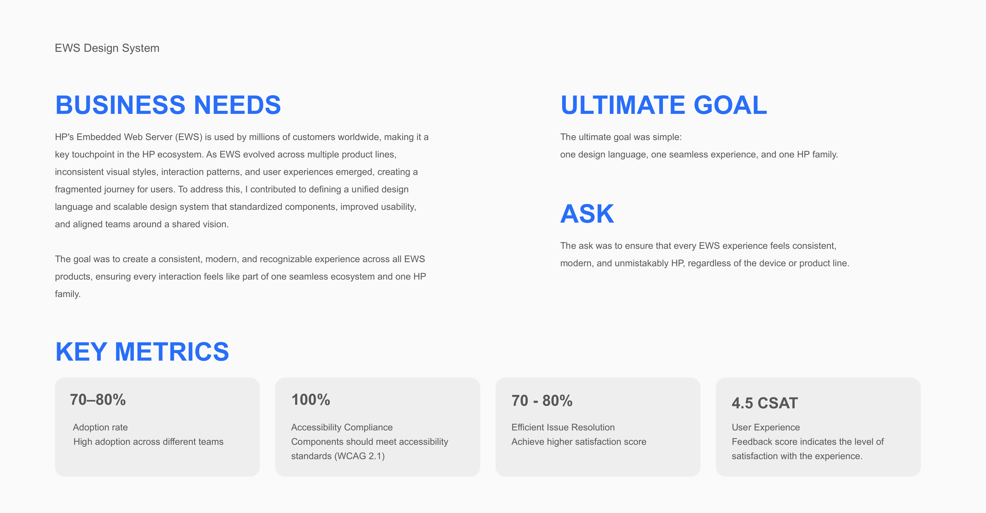
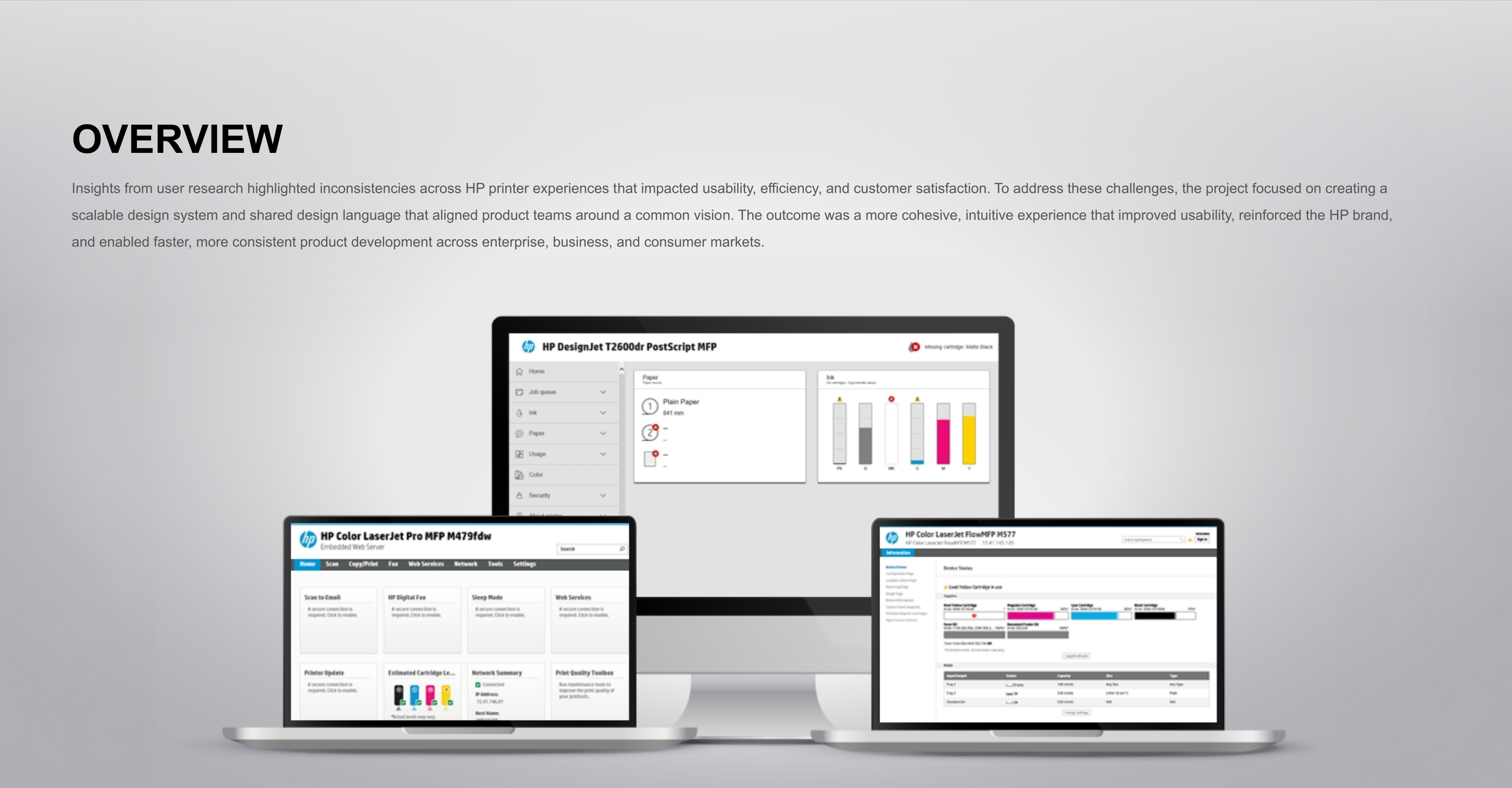
HP’s Embedded Web Server connects customers to their printers across enterprise, business, and consumer products. As those products evolved, visual styles and interaction patterns diverged.
I contributed to a unified design language and scalable system: standardizing components, improving usability, and aligning teams around a shared vision. The goal was a consistent, modern, recognizable HP experience across product lines.
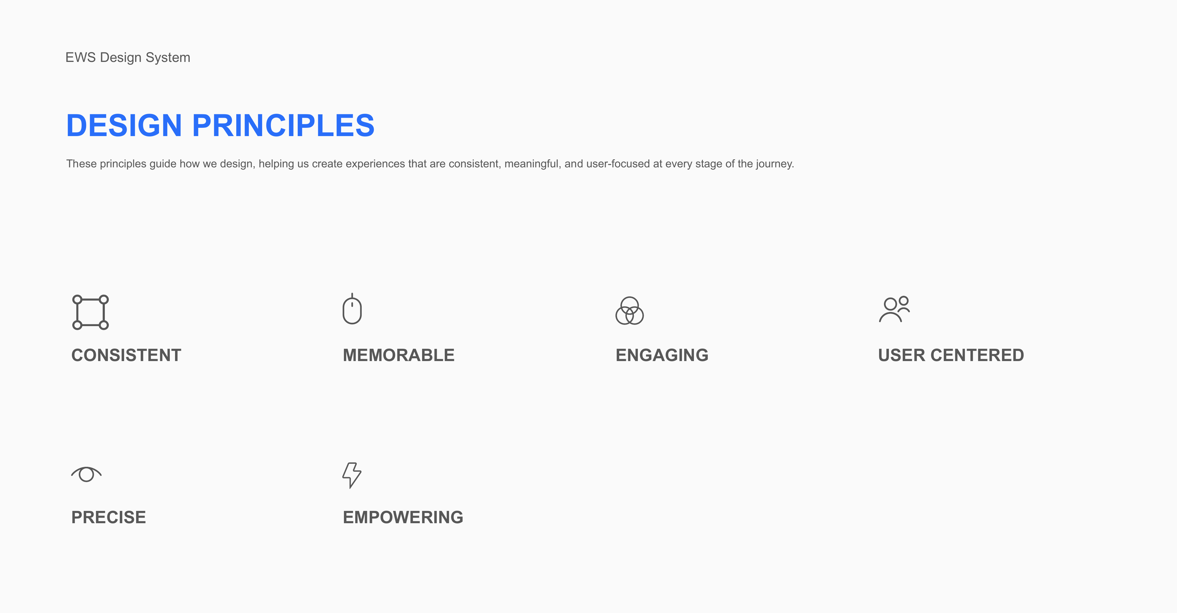
02 / Design principles
Six principles guide the system from the first interaction to the smallest detail.
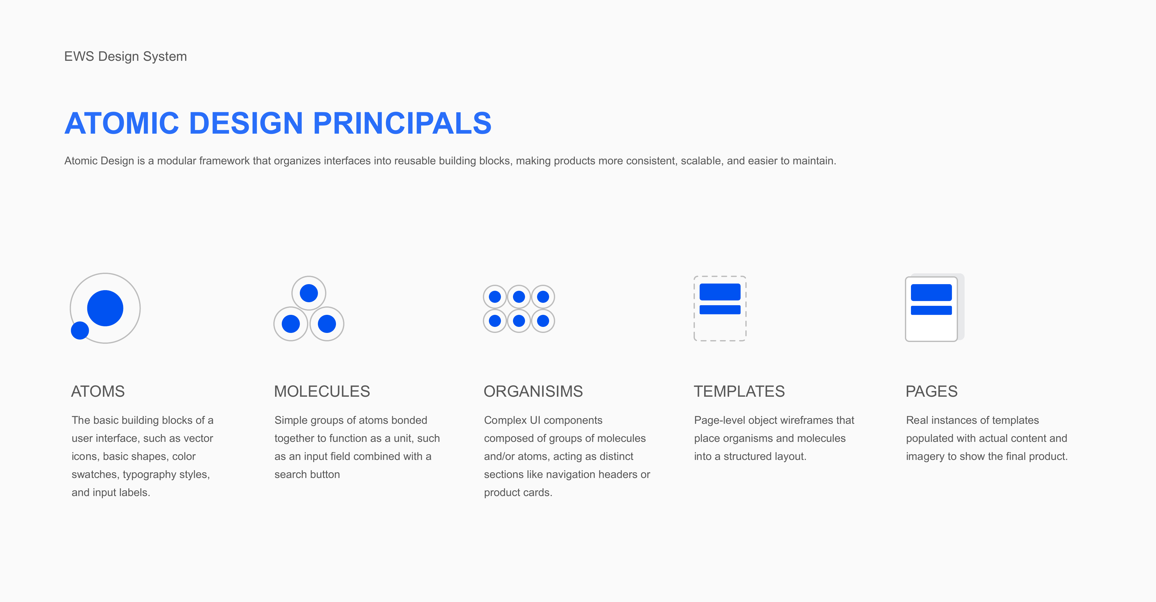
03 / Atomic design
The system uses a modular structure. Each level builds on the last, keeping interfaces consistent, scalable, and easier to maintain.
Icons, colors, typography, shapes, and labels.
Small functional groups, such as an input paired with a search button.
Complete interface sections, such as navigation headers and product cards.
Structured page layouts that organize the reusable parts.
Templates brought to life with actual content and imagery.
04 / Typography
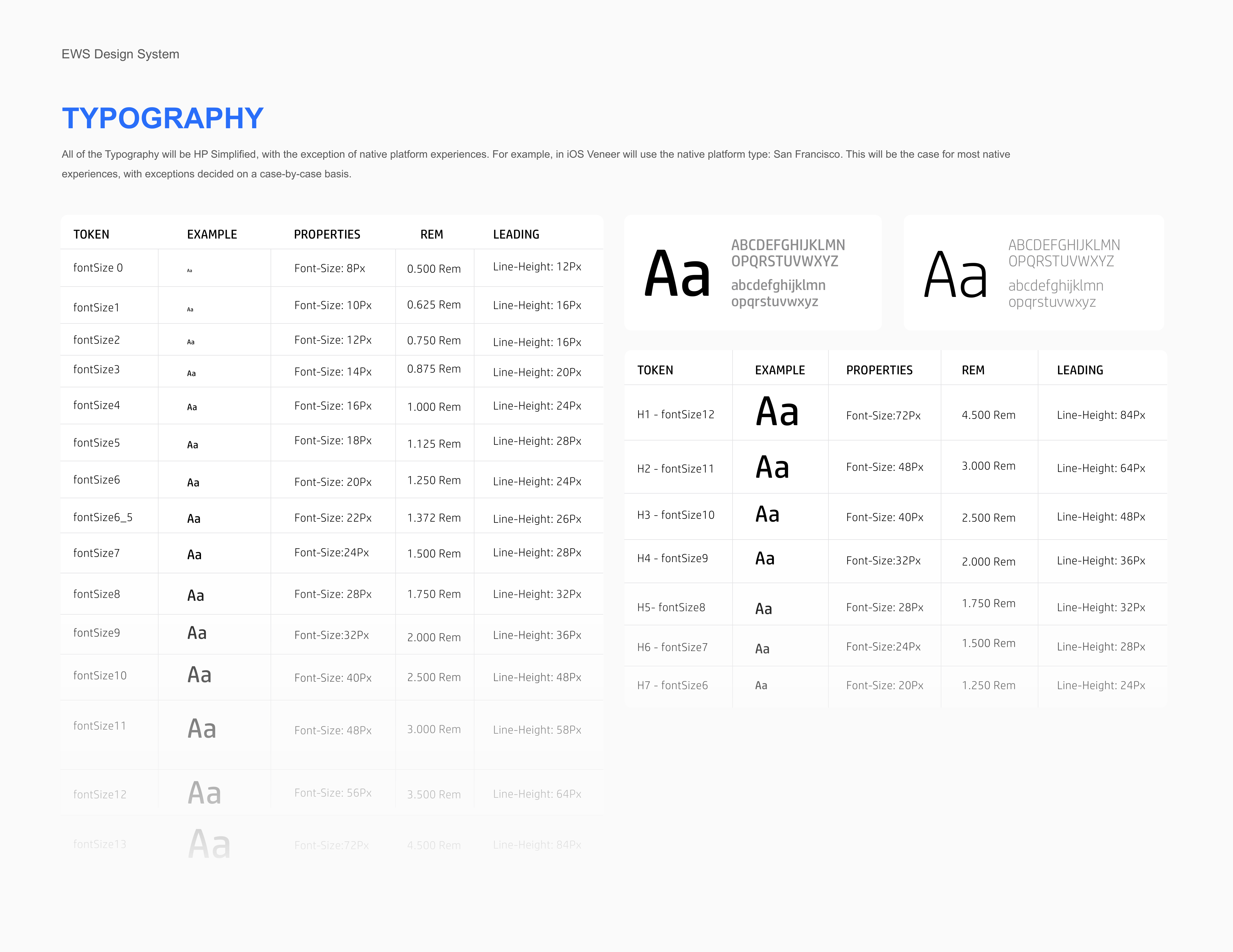
HP Simplified provides the shared typographic foundation. Native platform experiences can use their own typeface, such as San Francisco on iOS.
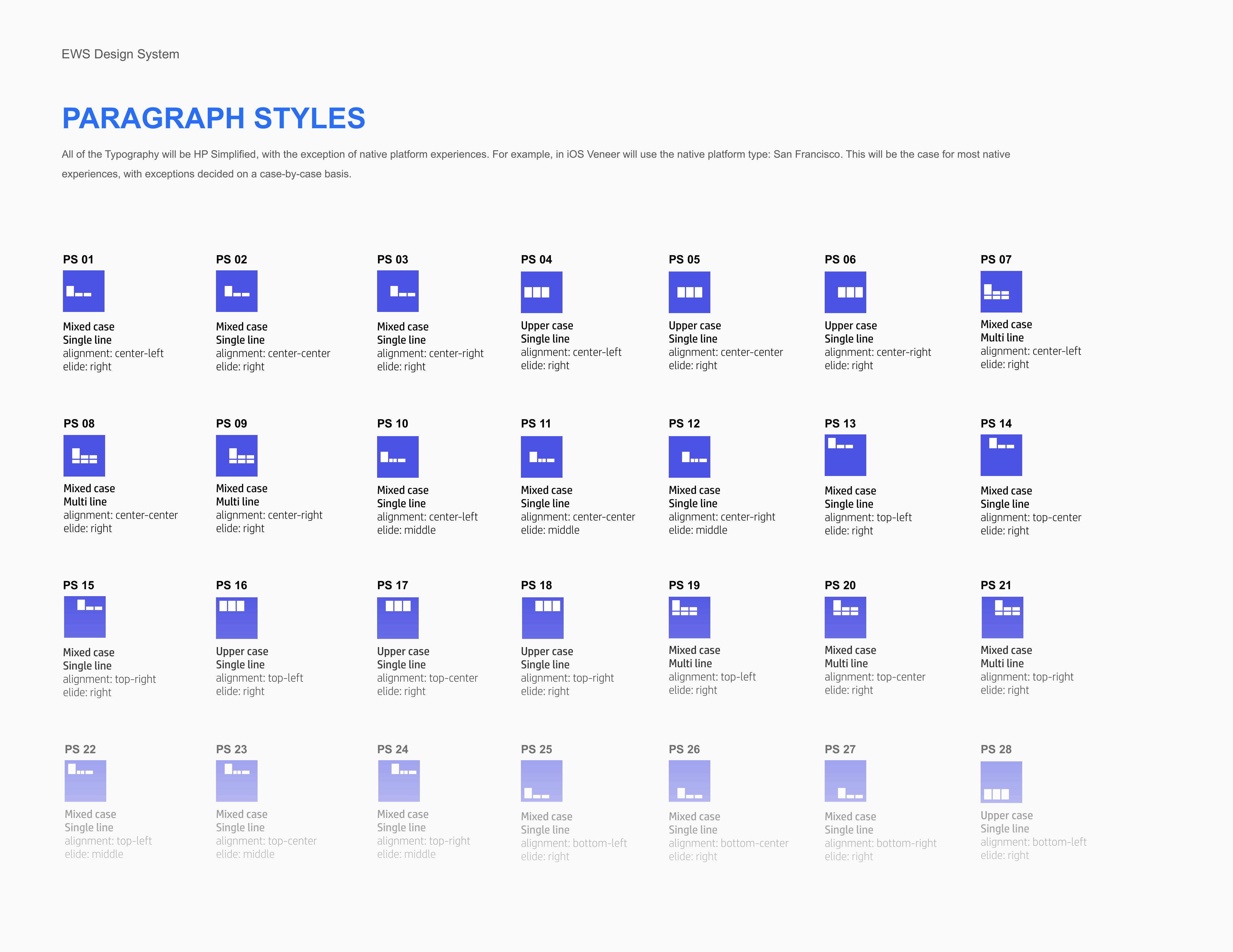
The guidelines define a size and line-height scale, heading styles, and paragraph behavior. Alignment, wrapping, case, and truncation are specified together so text remains predictable across components.
05 / Color
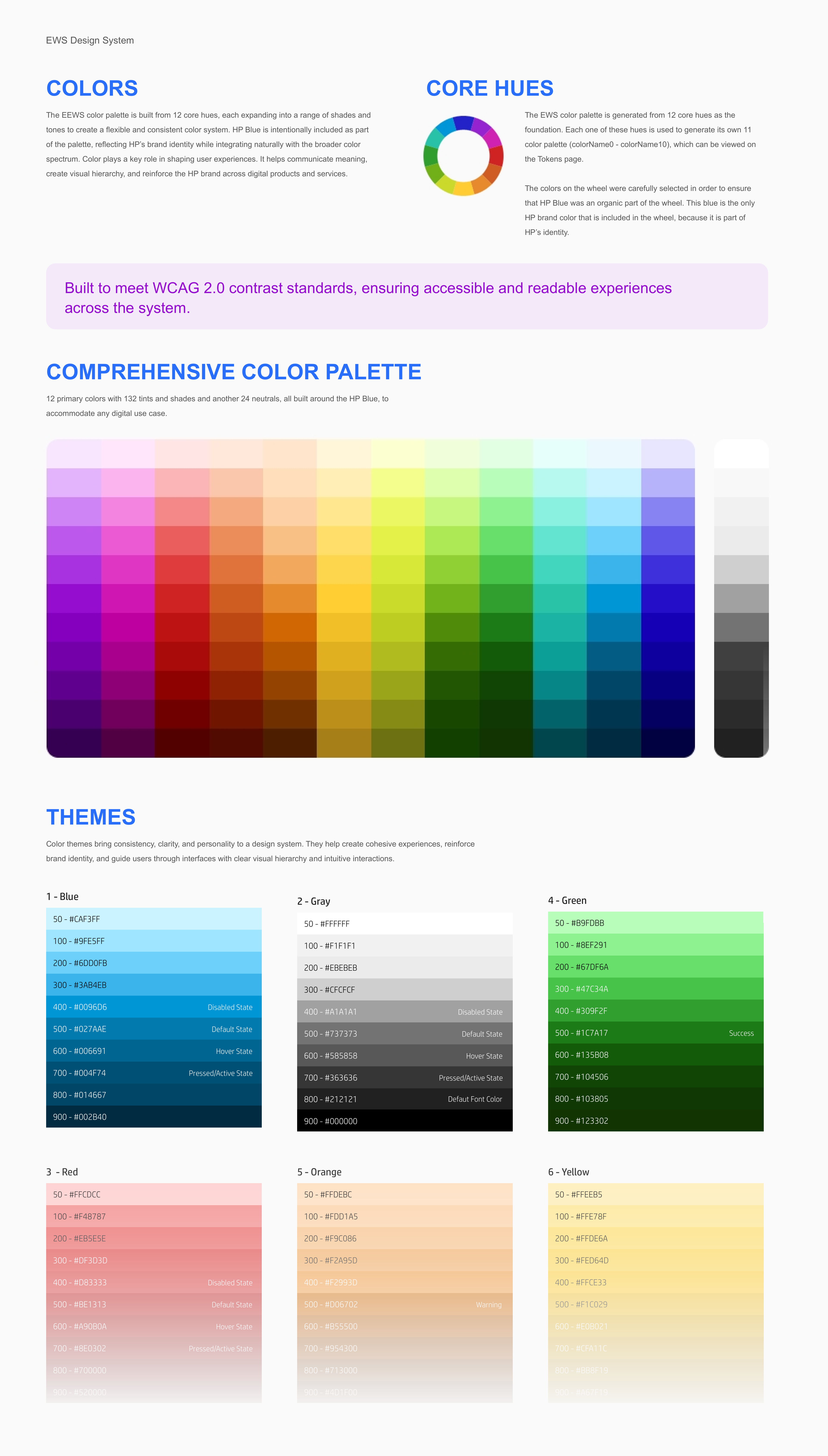
Twelve core hues expand into 132 tints and shades, supported by 24 neutrals. HP Blue sits within the spectrum, connecting flexible interface themes to the brand.
Color communicates status, establishes hierarchy, and distinguishes interaction states. The palette guidance sets contrast expectations for readable, accessible interfaces.
06 / Spacing & shape
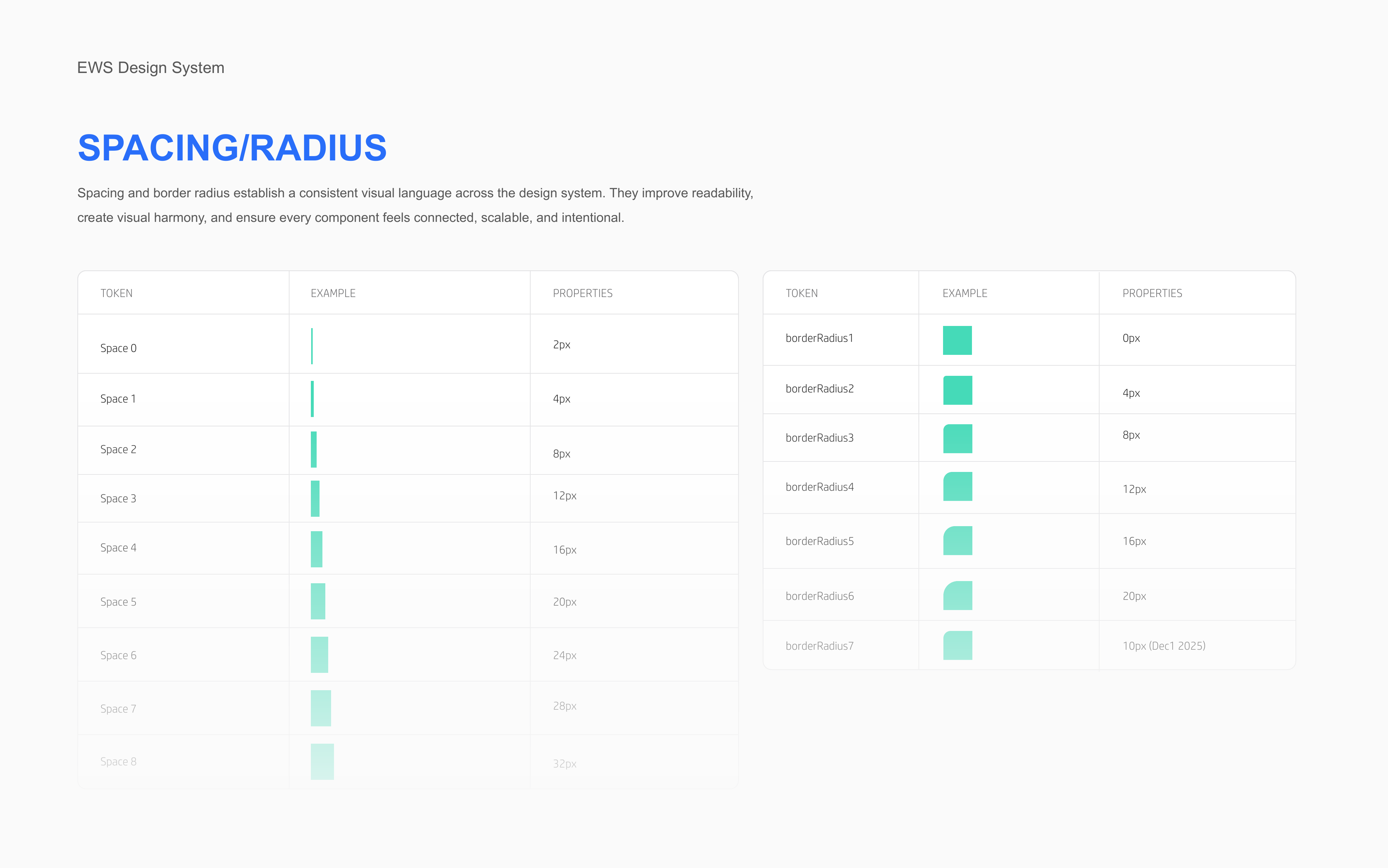
Spacing and corner-radius tokens establish a repeatable rhythm. The documented spacing scale runs from 2 to 32 pixels; radius options support both structured and softer component shapes.
These shared values connect individual controls to the larger page, improving readability and visual alignment.
07 / Components
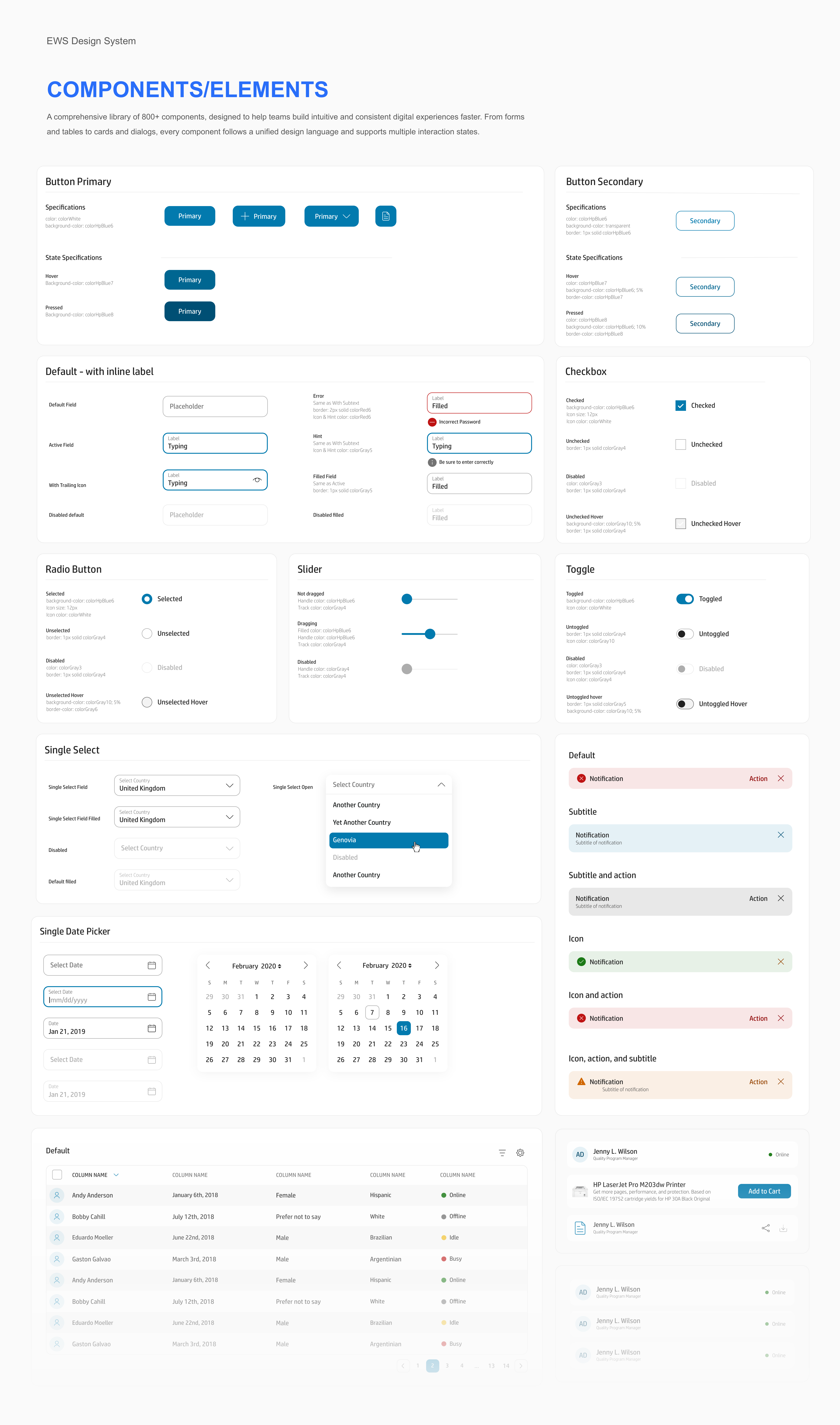
The project documents a library of more than 800 components. Forms, tables, cards, dialogs, and navigation share the same foundations and support multiple interaction states.
Default, active, selected, error, and disabled treatments give teams a consistent starting point for building complete experiences.
08 / Testing
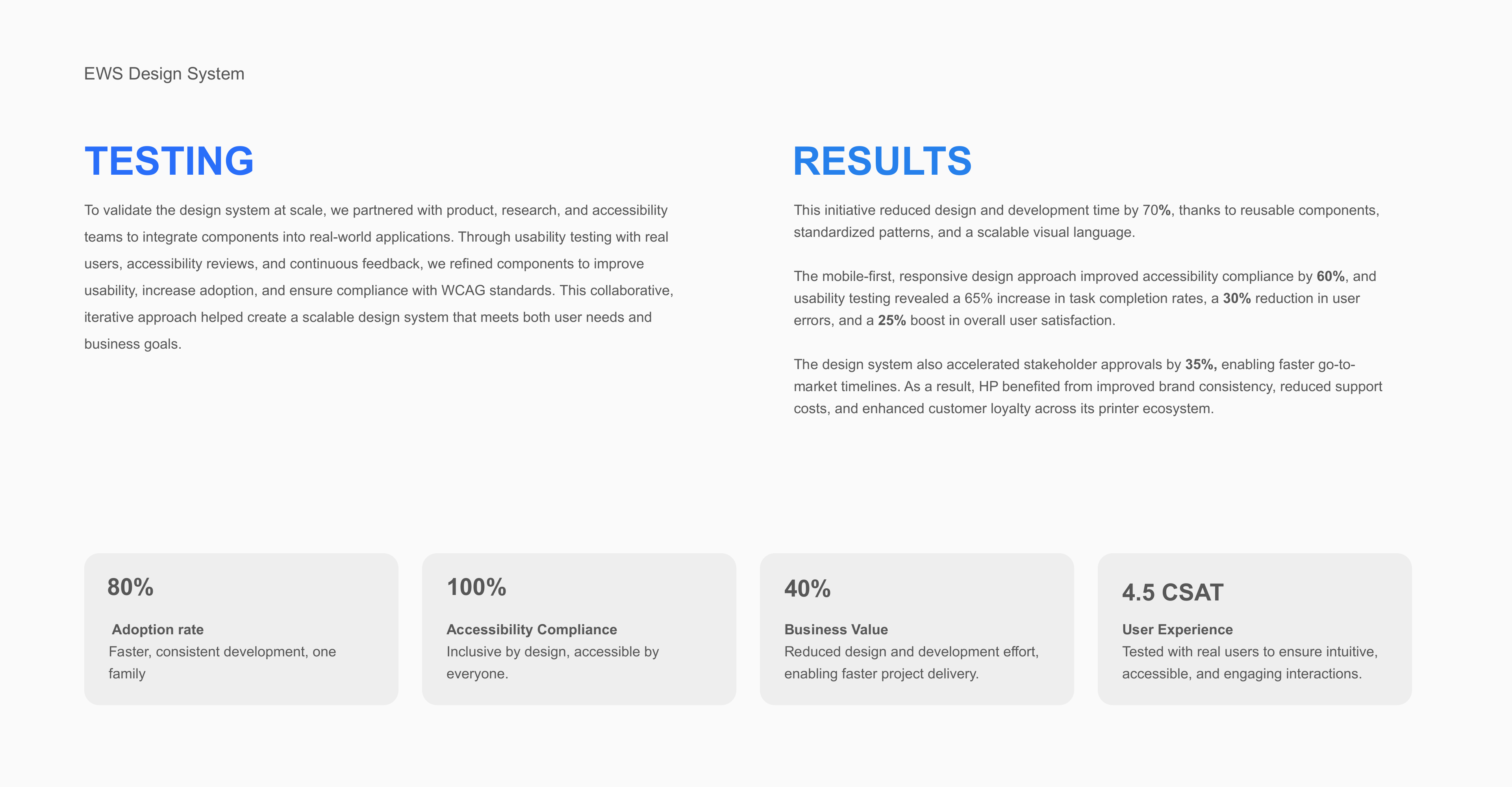
Product, research, and accessibility teams integrated components into real applications. Usability testing, accessibility reviews, and continuous feedback informed refinements to the library.
This iterative approach connected system decisions to user needs, adoption, and business goals.
09 / Reported results
The project summary reports the following adoption, accessibility, and experience results.
The PDF reports both 70% and 40% for reduced design and development effort; that figure is omitted here pending reconciliation.
Complete design documentation
Design documentation, presented in sequence. Open any visual at full resolution to inspect the specifications.